PaperDirect Blog PaperDirect Blog

August 15, 2014

Slogans Made Simple: Free Tagline Generators

Filed under: Designing Your Business Communication — Tags: — PDWriter @ 10:59 am

Taglines and slogans can be essential to creating buzz around your business. Everyone knows Nike’s “Just Do It” slogan. And of course, even after decades, most people can name the brand associated with “Where’s the Beef?”

But coming up with even the most simple tagline can be a lot of work. Luckily, there are automated online tagline/slogan generators that can help get your creative juices flowing. With most, users simply plug in a keyword to receive suggestions.

We tried out three of them, using PaperDirect” as our keyword, to get a feel for how they work.

Slogan Generator

This site has a nice, clean design and is simple to use. Plus, it gives you a few tips on how to create a good tagline or slogan. It created some decent ones but also came up with some that were totally out of left field.

The Surrealist Slogan Maker

Like its name, the Surrealist’s slogans are a little offbeat. But if you’re looking for taglines that are guaranteed to entertain you (even if you’ll never actually use them in business), this site is the place to find them.

Moxy Creative Tagline Generator

This fun interface allows you to select different data (product type, use, urgency) into robot-shaped graphic. The “robot” then spits out suggested taglines. The taglines are pretty basic and no matter what you enter, it’s the same variation of a central theme.

All were easy to use but there was a lot of variation in the quality of the taglines we received, as you can see below:

The (Pretty) Good

All You Need is PaperDirect and a Dream (The Surrealist)

PaperDirect, always a step ahead (Slogan Generator)

Try PaperDirect and Maximize Your Results – Soon! (Moxy Creative)

The Bad

Let the PaperDirect work for you (Slogan Generator)

PaperDirect, the fun overloaded. (Slogan Generator)

Go Home with PaperDirect at the Touch of a Button – Today! (Moxy Creative)

The Ugly

Big Chocolate PaperDirect (The Surrealist)

I Wish I Were a PaperDirect Weiner (The Surrealist)

Go Crack a PaperDirect (Slogan Generator)

If you’d like to try out a tagline generator, here are some things to keep in mind:

  1. Play around with the keywords; use your company name, your product or your industry.
  2. Prepare to spend time clicking through a lot of unusable material.
  3. Write down taglines that jump out at you and brainstorm with others about how to improve on them.
  4. Before going “live” with a tagline, ask yourself what you want the tagline to do (increase sales, build your brand, etc.).

In most cases, tagline generators won’t come up with the next award-winning slogan for you. They simply aren’t designed that way. But they can be a good jumping-off point to creating one that’s truly unique and unforgettable.

When you’ve finally settled on one, be sure to include it in all your business communications. The more customers see it, the more they’ll associate it with you and your company.

March 4, 2014

How to Make a Professional Company Letterhead

Filed under: Designing Your Business Communication — Tags: , , — PDWriter @ 10:12 am

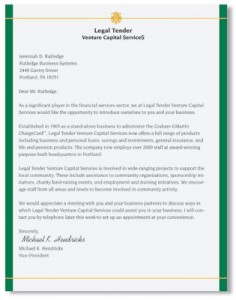
Debonaire Foil Border Papers  by PaperDirectA professional letterhead elevates your business communications and projects your brand. Modern tools and improved printer technology mean that it is possible to make professional letterhead right in your office.

Choosing a Professional Font

There are thousands of free and paid fonts available. Consider your business’s branding and image when choosing the one that is best for your letterhead. For a modern feel, look at fun options like Coolvetica or Abraham Lincoln. More reserved or authoritative brands may prefer classic fonts like Garamond or Bookman.

Look specifically for fonts that have been optimized for print; ones which are geared toward screen display, such as Georgia or Verdana, will not have as crisp and clean an appearance as those designed with print in mind. Limit your design to one serif and one san serif font for a clean, readable and professional look.

What to Include

Blue Elegance Foil Letterhead by PaperDirectWith all of the points of contact modern businesses have, it can be hard to decide what to include on your company’s letterhead. When deciding how to make a letterhead for your business, include the options your clients are most likely to use and those that best display your firm’s strengths. At minimum, include the company name, logo, street address and phone number. You can also include an email address and the company URL if you have room.

Valuable Online Tools

Not a designer? You have nothing to fear. There are a number of tools online to help you create the perfect letterhead for your business. When learning how to make a letterhead, look at examples online from other businesses and take note of features you like. Then, use online design software or handy free templates to put your vision into action.

As you design your letterhead, think about the paper that best represents your business. PaperDirect offers a number of options, from earth-friendly recycled stationery paper to thick and creamy parchment. Come to us for paper worthy of your business image.

August 21, 2013

Nothing Says “Professional” Like a Sleek Set of Business Cards

Filed under: Designing Your Business Communication — Tags: , — PDWriter @ 7:37 am

Ambassador Business Cards by PaperDirectYou only have one chance to make a good first impression in the business world. Nothing works better for fulfilling that purpose than business cards.

A business card forms an important part of building your brand identity. It offers a snapshot of your business to clients, vendors and investors alike. Your bottom line hinges on making a good impression with these people. Creating a sleek set of business cards will showcase your brand in a positive light.

What essential elements should your business card include? Contact informationRoyal Business Cards by PaperDirect is the most important thing. Include the current address, phone number, email and website for your business. This will make it easy for people to know they can reach you and that you will be available to answer questions or take feedback.

Your business card should also include key parts of your branding strategy. It can be designed with the same logo, graphics and color scheme you use on all marketing materials related to your business. You can also include the slogan you typically feature in your branding message. These little touches will help people remember your company and Metro Style Business Cards by PapeDirectalso influence them to tie specific products or services to your brand.

A set of business cards makes you look and feel more professional. They are perfect to hand out at trade shows and conventions. A good business card is also a great conversation piece. It can spark additional interest in your company and get people asking more about what you do. There is no way you can afford to do business without including business cards in the picture.

Check out PaperDirect to see the latest selection of business cards. We offer dozens of business card designs to fit your needs and your tastes.

March 25, 2013

Business Cards Do’s and Don’ts

Filed under: Designing Your Business Communication — Tags: , — PDWriter @ 2:27 pm

Ambassador Business Cards by PaperDirectAs Forbes puts it, the business card can be the “entrepreneur’s best friend.” Business cards represent an inexpensive, yet powerful, marketing tool that puts your information out into the world — and into the hands of potential customers, employers, business partners, and other movers shakers in your network.

That is, when it’s done right.

When it’s done wrong, well… the entrepreneur’s BFF can turn into his worst enemy. OK, that might be a bit dramatic, but think of it this way: Often your business card represents your first — or maybe your only — chance to make a good and lasting impression. So, although no one wants a boring business card, the alternative may be even worse. Who knew these little pieces of paper were so important?

These “do’s and dont’s” will help you get your business cards just right.

Business Card DO’s

Your card should include your essential information, such as:

  • Full nameRoyal Business Cards by PaperDirect
  • Title
  • Business Name
  • Email
  • Phone Number/s
  • Website or online portfolio
  • Physical Address

Additionally, follow these tips for business card DO’s:

  • Whatever a potential client, employer or networker would need to get in touch with you should be on your card.
  • Keep your card design simple. Left align tends to look less cluttered and is easier to read than center or right-aligned designs. Pick a simple, classic font and stick to it; at most, use two complementary fonts.
  • Use color, but keep the palette to three or — at most — four tones that work well together. Choose darker colors as they’re easier to read and use larger font sizes because, again, they’re easier to read.
  • Include your business logo and other branded materials. Your business cards should match the look and tone of your company’s website, storefront and other marketing formats.
  • Tailor your business cards’ overall look and theme to your industry. In banking or law? Choose a conservative, dignified theme. In design, art or fashion? Choose a theme that reflects your innovative style.
  • Finally, use high-quality cardstock and a professional printer to create your cards. After all, they represent you and your business!

Business Card DONT’S

Metro Style Business Cards by PaperDirectWhile including your essential contact info is essential, avoid including too much information. After all, this isn’t your resume or your portfolio, so you don’t need to list all of your skills and experience. Packing your card full will also make them appear cluttered and unprofessional.

Stick with your company’s established branding. You want a cohesive, memorable look, and using too many different colors, fonts or themed elements just distracts from the overall message.

Similarly, avoid using generic clip art on your cards. It looks cheap and unprofessional.

Finally, avoid using untraditional materials, such as chocolate or soap. Yes, it’s cute and creative, but once it’s all used up, so is your message — and your contact info.

For professional, custom designed business cards that will create a lasting positive impression, browse the huge selection at Paper Direct!

May 9, 2011

Pick the Perfect Font for Any Occasion

Filed under: Designing Your Business Communication — Tags: , , — PDWriter @ 8:00 am
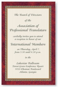
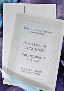
Formal Party Flat Invitations

Every day we look at fonts of all types whether we realize it or not. A font is defined as “a complete assortment of type of one style and size”. In other words, a font is the letters you see that make up the words you read. Whether you’re reading a newspaper or book, looking at emails or even the crawl running along the bottom of the screen on ESPN, you’re looking at a font. Choosing the right font for every occasion is important.

Imperial Letterhead Papers

Not only does a font deliver information in words, but it also delivers a “feeling” with its style. There are literally tens of thousands of fonts available and choosing the “right” one can be a real challenge. Depending on the purpose of the document or paper, there are a few font styles that work quite well for a variety of uses.

If you want an easy-to-read document, then you’re looking for what’s called a “Sans Serif” font. That means there are no little “tails” off of any of the letters. While they usually aren’t very fancy, they are easy to read and less expensive to print. Samples of this type of font are Calibri, Arial and Berlin Sans. Any font that has “Sans Serif” in its title will be of this style.

For a somewhat more business-like flair, you’ll want to use a font with serifs. These fonts are a tad harder to read, but have a more professional look than the “draft” sans serif styles. Perhaps the best known font of this style is Times New Roman which is the most common closely followed by Courier, unless you’re in banking where Copperplate was also very common.

Intricate Flat Invitations

For formal occasions like weddings and formal party invitations you can expect to see a script or calligraphic style font. These are very flowing, cursive style fonts which add a layer of beauty and grace to the documents. These often get used in logos and letterheads to portray a level of elegance to the business. Fonts like this are MT Script, Monotype Corsiva and Lucinda Calligraphy.

Choosing the right font for the occasion can be just as impactful as the words being used. You don’t want something too formal for casual documents, nor do you want a casual font for a formal or business document. And there are “play” fonts like Comic Sans Serif which you can use to make fun signs and even symbolic fonts like Widgets that you can use for math symbols and even shapes. To have a successful document, whether it’s a business letter or a wedding invitation, using the right font for the job will get it done.

Powered by WordPress